The Architecture of Ideal Learning Environments
We talked to some of the leading architects in the country about five key principles in K–12 school design.
Your content has been saved!
Go to My Saved Content.To get a sense of the best practices in contemporary school design, we interviewed four of the top K–12 architecture firms in the U.S.: Fanning Howey, Corgan, Perkins+Will, and Huckabee. Collectively, the companies bill hundreds of millions of dollars in work annually, and have built or renovated thousands of schools throughout the country and around the globe.
Key insights into five common design principles—technology integration, safety and security, transparency, multipurpose space, and outdoor learning—surfaced during our conversations.
Technology Integration
At the dawn of the digital era, technology integration in most K–12 schools boiled down to the presence of computer labs, separate rooms filled with bulky terminals that students could sign up to use. Today’s school technology represents a quantum leap forward—it’s at once ubiquitous, invisible, personal, and mobile.
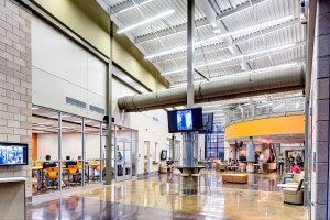
Wiring the entire school—including the outdoors—is necessary, architects agree, and projectors, screens, and sound systems are migrating out of classrooms and into hallways, common spaces, cafeterias, and even stairwells. Students can access the network anywhere on campus, and view and share work on digital displays throughout the building. The effects can be subversive in all the right ways, reducing students’ dependence on the teacher, promoting peer-to-peer collaboration, and widening the sphere of learning from the confines of the classroom to the whole school grounds.
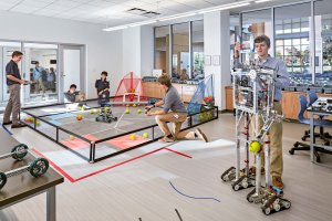
“The students we’re educating don’t know the world without the internet,” says Kerri Ranney, vice president of educational practice at Huckabee. “We need to be able to embrace that and prepare students for the types of work environments and companies they are going to be working for when they get out of school.”
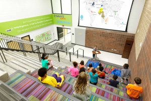
At Ecole Kenwood French Immersion School, a pre-K to sixth grade public magnet school in Columbus, Ohio, designed by Fanning Howey, the stairway has been extended to accommodate carpeted student seating and features an overhead projector, a large projection screen, a sound reinforcement system, and wireless access. The location is a popular spot for lectures and student presentations as part of project-based learning (PBL).
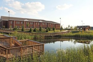
And In Whitestown, Indiana, Fanning Howey designed a wet retention basin—a pond that collects stormwater—as an outdoor laboratory for Zionsville West Middle School, a public school.
“The one-acre pond has shallow-depth areas for wetland plant species, and the boardwalk has observation decks with wireless access for small group instruction. Many of our school projects have Wi-Fi in these outdoor spaces. In fact, it’s pretty much an expectation,” says Jeff Bolinger, a landscape architect with Fanning Howey and a member of the American Society of Landscape Architects.
Safety and Security
The horrifying events in Columbine, Colorado, and Parkland, Florida, among many other places, have raised the profile of safety and security measures in school design. But while safeguarding against acts of school terror is uppermost in the public mind, student bullying is a more pervasive, everyday issue and poses its own set of architectural challenges.
Not surprisingly, bullies seek out areas tucked away from adult supervision. In a recent study from the National Center for Education Statistics, students between the ages of 12 and 18 reported nearly twice as many bullying incidents in hallways and stairwells—where they spend a fraction of their time—as in other school areas like cafeterias or playgrounds. A more open, transparent design emphasizing windows and clear lines of sight, even between floors, reduces bullying opportunities and improves the learning environment for vulnerable students, according to architects.
“The old layouts present an anonymous kind of situation, and it’s easy for bullying to take place in those spaces,” says David Stephen, an educator and architect and the founder of New Vista Designs for Learning, a school design and curriculum consulting firm in Boston. “It’s much safer to have more visual interconnectivity because you have lots of sets of adult eyes connecting with kids around the school.”
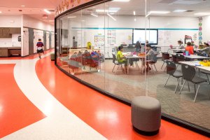
At Annie Purl Elementary School, a pre-K to fifth grade public school, in Georgetown, Texas, the Huckabee architecture firm designed and installed floor-to-ceiling glass classroom walls. Each academic wing features classrooms that connect to a central collaboration space and a teacher design lab—enabling educators to see kids in the classroom, collaboration space, or corridors from virtually any spot in the learning environment.
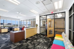
In the unlikely event of an intruder or an active shooter in the building, architects rely on multiple layers of security. Having a single point of entry to the school is standard protocol to limit unwanted access, but many schools are starting to install double-locked entries—with two locked doors to get through—and often require sign-in and use video surveillance systems to screen visitors before they enter campus.
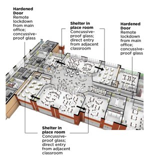
Counterintuitively, large open spaces can provide protection during a lockdown. The architects of Fanning Howey describe several levels of security within an academic wing designed to prevent the unthinkable at a midwestern public school. The two sets of entry doors bracketing the academic wing are made of bulletproof glass and can be locked remotely from the main office, transforming the shared learning space into a safe haven. If an intruder gains access to the academic wing, four corner classrooms serve as shelters—each is outfitted with bulletproof glass and can be accessed from common areas and adjacent classrooms, and then sealed off from any further entry.
Transparency
Architectural transparency, the principle of visual interconnectedness, is an emerging standard in new school construction. Internal spaces like hallways, classrooms, and cafeterias—typically separated from each other by opaque structures like walls and doorways—have given way to open layouts that emphasize glass partitions and uninterrupted lines of sight, borrowing from cutting-edge work environments like Google’s and Apple’s campuses.
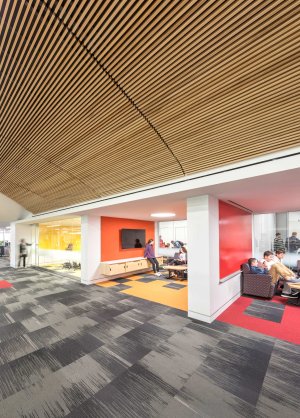
“In very traditional schools, hallways often look exactly the same,” says Stephen, of New Vista Designs for Learning. “They’re 10 feet wide, lined with lockers, and the classroom doors are all closed.”
Opening a line of sight into adjacent spaces makes learning communal, encourages collaboration, and creates a public forum for celebrating and observing student work, according to leading educational architects.
Fanning Howey constructed the British International School of Houston in Katy, Texas, a pre-K to 12th grade private school, with the intention of making learning visible. The entire building is wrapped around a common area called the Agora—Greek for “gathering place”—which is modeled on the public courtyards at the heart of city life in ancient Greece.
All the classroom walls that surround the Agora are framed in floor-to-ceiling glass. From this central gathering place, students of all ages can see and be seen, peering into others’ classrooms to view what they’re doing while being observed at their own work.
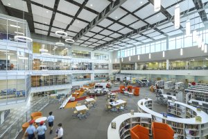
“Through visual transparency—by looking through a window into something interesting happening in a makerspace, robotic lab, or a classroom—you’re creating a public conversation about teaching and learning,” says Stephen.
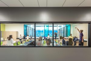
Floor-to-ceiling glass isn’t the only way to achieve transparency, though. Perkins + Will used a cheaper alternative—strategically placed glass windows—at Campus International School, a kindergarten to sixth grade public magnet school in Cleveland, to create a continuous line of sight throughout the space. While the effect is less dramatic, the design is more cost-effective and the learning impact is similar, promoting a sense of collaboration and enabling students to gain inspiration from the work of others.
Multipurpose Space
The pace of social and technological change is disorienting—and modern learning environments are evolving to keep pace. Part of making educational spaces work, according to architects, is incorporating long-term flexibility so that as technology, curricula, and pedagogies evolve over a building’s 50-year life span, it can support and not hinder those changes.
“We know education is going to change. We know curriculums are going to change. So how best do we provide a facility that is equipped to change over its life?” says Chuck Tyler, principal architect at Fanning Howey.
School architects are tossing out industrial-era blueprints that emphasized enclosed, single-use spaces connected by long hallways designed to move students rapidly between bell periods. Today, every inch of the school is scoured for its ability to contribute to learning: Corridors are being widened to become extensions of the classroom, stairs are turning into seating space, and walls throughout the building are doubling as writing surfaces or displaying Wi-Fi-enabled TV screens. Typical, single-use rooms like cafeteria and libraries, meanwhile, are being designed to function as hybrid theaters, makerspaces, and media centers.
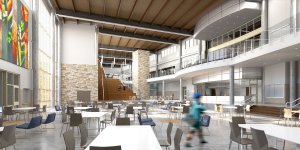
“There’s a realization and understanding on the clients’ side that the factory model school that most of us went to—where you’ve got similarly sized classrooms marching down either side of the hallway—is not going to support the kind of teaching and learning that they’re after,” says Steve Turckes, principal and K–12 education global practice leader for Perkins+Will.
Truly flexible spaces should also meet the day-to-day needs of educators to create instructional variety—direct instruction, group work, independent work—by quickly altering their environments. Lightweight chairs, beanbags, area rugs, tables of different heights, and even movable or foldable walls can transform alcoves into quiet reading spaces, which can in turn be modified to suit project-based learning or direct instruction.
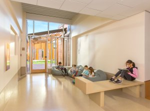
For example, at Milan High School, a public school in Milan, Michigan, the PBL learning addition called the Milan Center for Innovative Studies has a designated collaboration space, the Innovation Zone, where students conduct individual research, collaborate on group projects, and give presentations. But the Innovation Zone also serves as the school’s social hub and hosts the campus coffee shop and student-run bookstore, mimicking the integration of work and relaxation space that is so common in today’s start-ups and cutting-edge technology companies.
Outdoor Learning
Research suggests that there are many benefits from learning in the outdoors, including improved creativity and reduced stress. And a 1998 study concluded that when learning is hands-on and made relevant to students’ surrounding environment, they are more engaged in the curriculum and perform better on academic tests.
According to leading education architects, some outdoor learning environments are simply spaces that facilitate learning—a group of benches, an amphitheater, or a partially covered workspace with amenities like Wi-Fi and supplies. Like classrooms, these outdoor spaces are designated for instruction, presentations, or independent and group work, but they provide a fresh perspective for students who spend most of the school days indoors.
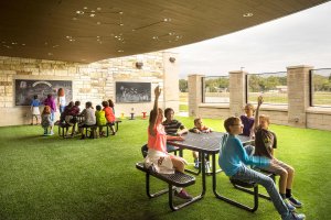
Other outdoor learning spaces are designed to be extensions of the curriculum, and provide opportunities to observe or interact directly with nature.
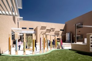
At Daugherty Elementary, a public school in Garland, Texas, the architecture and design firm Corgan created a learning courtyard that offers a variety of educational zones connected to Texas state standards. On the pavement, there are imprints of fossils native to Texas. Shadow walls—where suspended panels with cutout images cast shadows as the sun shines through the cutouts—teach students about the earth’s rotation and seasonal cycles as shadows cast by the sun shift positions and lengths. A rainwater cistern enables students to track rainfall totals, while xeriscape landscaping—which requires little to no water—helps students learn about local, drought-tolerant plants and gain authentic experience with complex biological concepts like photosynthesis and osmosis.
And at Lady Bird Johnson Middle School in Irving, Texas, the biggest net-zero public school in the country—it generates more energy than it consumes—the building itself is a laboratory for learning. Corgan designed the building’s green energy capacities to integrate with the school’s grade 6–8 science curriculum. For example, in sixth grade, students collect data and do hands-on learning related to energy transformation, comparing the efficiency of fossil fuel to solar, wind, and geothermal power—all sources of energy that the school taps into.
