Finding the Right Balance in Tech Use
Students engaged in a five-week app design process in part to examine their own use of technology.
Your content has been saved!
Go to My Saved Content.Recent reports about the potentially negative impacts of social media and screen time have triggered a debate about balancing technology integration with life skills.
That debate frequently lands squarely in the laps of technology educators, who are passionate about engaging meaningful learning through technology yet also want to promote healthy balance.
It was this conundrum that Liane Rae, Alexa Duda, and I faced when designing the required ninth-grade Technology Foundations classes at St. Mary’s Academy in Portland, Oregon. Our answer? Challenge students to design apps to promote healthier choices around technology use.
This design challenge project, which lasted about five weeks, served as a final assessment for the course, engaged students in a design thinking process, addressed a real problem that has direct impact on students’ lives, and triggered deep conversations about how to use technology in positive, balanced ways.
The project aligned with several key areas of the ISTE Standards for Students. The design process we chose integrates aspects of the models of both Stanford’s D.school and the Institute for Innovation in Education. We highly recommend these resources for use in K–12 education.
Stage 1: Research and Analysis
Students began by gathering data on their own technology use. For three weeks, they used spreadsheets to log everything from screen time to social media use to frequency of notifications to how they used devices to do homework. At the end of each week, students dumped their data into surveys that allowed them to see trends across the whole class.
We then placed the students in teams. They analyzed the data from the surveys and interviewed older students about their technology use. The interviews helped the teams gather additional data from the student population while also practicing listening and interviewing skills. (This stage incorporated ISTE Standard 3: Knowledge Constructor.)
Stage 2: Definition of User and Problem
Once the data gathering was complete, it was time to focus on defining an audience and a problem to solve. First, each team created a fictional, highly specific user profile based on the data they had gathered. The profiles included sketches of the user and detailed information about the user’s habits, hobbies, academics, interests, and needs.

Next we asked students to create a point-of-view (POV) statement for their user by writing out a description of what the user needed an app to do and what problem or challenge the app would address. (This stage incorporated ISTE Standard 5: Computational Thinker.)
Stage 3: Development and Prototyping
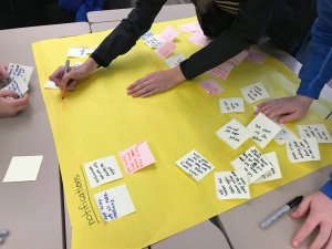
The development stage began with students brainstorming as many ideas for their apps as possible on sticky notes. Students categorized the notes into piles and used their POV statement as a guide to analyze, discard, and revise their ideas. When ready, the teams sketched their app designs on poster paper.
The amount of creativity and depth of thought demonstrated during this process was staggering. The app ideas included functions to shut down social media tools during homework, notifications to encourage mindful moments, customizable avatars to encourage positivity, game-style incentives to support study skills and focus, and so much more.

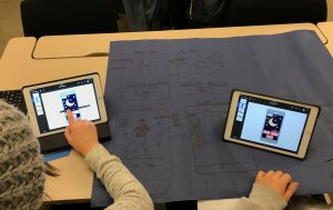
Students then created prototypes. Although the Tech Foundations class introduces students to basic coding principles, most students did not yet have sufficient coding knowledge to actually build an app. Instead, they used their choice of tools (such as paper cards or Keynote slides) to wireframe their app—creating a schematic, visual representation of how it might look.
Keynote turned out to be a favorite tool, since students could use animations to add motion and links to create the appearance of working buttons. (This stage incorporated ISTE Standard 4: Innovative Designer.)
Stage 4: Testing and Revision
Once each team had a working prototype, they tested their app design with other teams in the class and then with other students in the school. We encouraged them to let the testers play without interruption and ask open questions to obtain useful feedback. Based on the feedback they received, students revised and further developed their designs. (Like Stage 3, this stage incorporated ISTE Standard 4: Innovative Designer.)
Stage 5: Presentation
To round out the project and ensure that each team’s efforts were celebrated, we asked the teams to give polished, well-organized presentations that included:
- Their user profile and POV statement.
- Specific data they relied on for their design.
- A brief explanation of their process, including how they revised the app based on testing feedback.
- A live demonstration of their app design.
- A reflection on what they learned and what they would do next if they were to continue on to building their app.
(This stage incorporated ISTE Standard 6: Creative Communicator.)
What Did We Learn?
Real-world design projects are an excellent opportunity to create deep, engaging, differentiated learning for students. Every learner in our classes found the work relevant and empowering, and each team got to work at their own pace within a loose but clear structure.
They practiced essential skills—creativity, collaboration, communication, empathy, and problem solving—at a deep level, which has affected their work for other content areas and strengthened their sense of community as a class.
And they should now make more educated, positive choices about their technology use.
