3 Considerations for Using Classroom Charts Effectively
Teachers can avoid visual clutter and improve the efficacy of charts by focusing on visibility, timing, and student ownership.
Your content has been saved!
Go to My Saved Content.Before my first year of teaching, I spent hours scouring local teacher supply stores in search of the perfect classroom decor. I scored charts that defined prime numbers and fractions, listed parts of speech, and named the writing process. Throughout the year, I spent hours perfecting the charts that would hang on my classroom walls, making sure the handwriting was perfect, the borders just right.
There was good intention behind my actions—the hope that students would use these charts as guides to complete work. But I never taught students how to use the charts as cueing systems for learning, and I rarely referenced them during lessons. Instead of changing them as the year progressed and new units started, I simply added more, covering every inch of wall space by the time the last day of school rolled around.
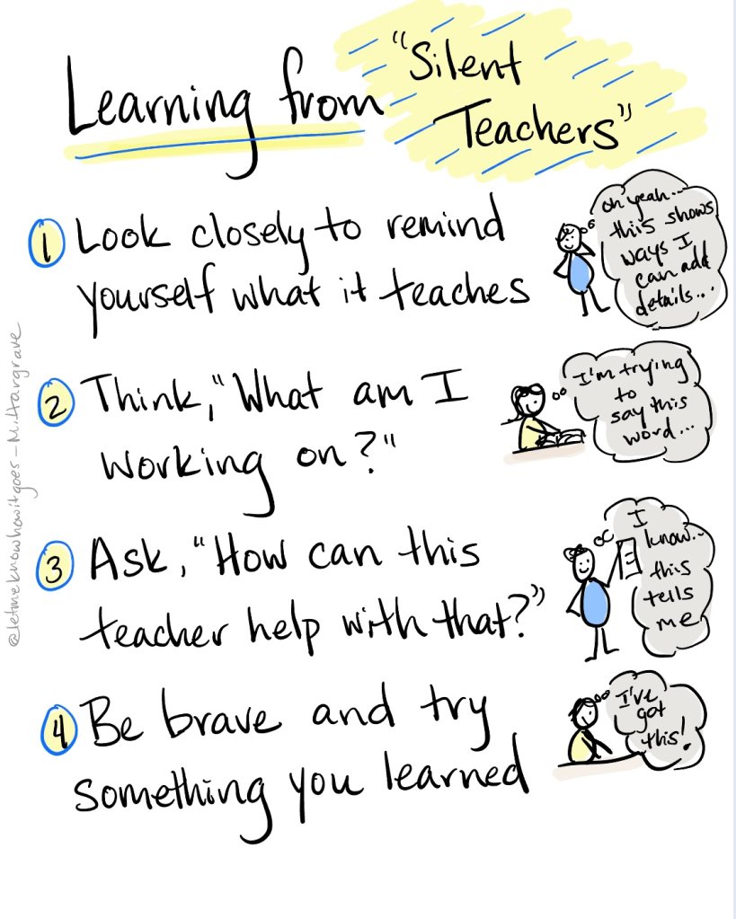
If I could go back, I would teach students early and often how to use charts more effectively, in ways that support their independence and agency. In order to help all learners access and use these powerful “silent teachers,” we should take into consideration visibility, timing, and student ownership.
1. Visibility
Will students be able to visually access charts? When bulletin board space is filled, there is no place to go but up. I have been in many classrooms where teachers have charts reaching all the way to the ceiling. It is highly unlikely that students will look up that high and equally unlikely that teachers will remember to reference these charts while teaching. Instead, when considering the placement of charts, think about student line of sight. What will they be able to see from their workspaces?
It’s also important to think about how to make wall displays aesthetically supportive of student learning. One strategy used in a New York City school involved color-coding specific subject areas. You could walk into any fourth-grade classroom and know exactly where to look for a given subject area. Students knew that purple/yellow meant writing, red/blue meant math, green meant a resource that could be used across subjects, etc.
2. Timing

Ask yourself, when is the best time to share this particular chart with students? Hold back from putting everything up at once; instead, share it when a lesson is taught. Remind yourself that it’s OK to start a unit with empty walls and unfinished resources. In due time, you will fill those spaces with content that matches your teaching. Adding content to a chart at the time you teach it will make the usefulness of the tool obvious to students.
Consider how resources will change and grow over time. It should be rare that a chart is put up at the start of the year and remains up until summer break. As the year progresses, think about what you could add or change. When you move to a new unit or start a new semester, ask students what charts they’re using or not using. Have discussions about whether a resource is helpful or if something else might be more helpful. When it feels as though students have mastered a skill, make a big deal over their graduation from one chart to another. Of course, if you have a few students who would still benefit, you can give them an individual chart to use as needed.
3. Student Ownership
Charts are for students, and the ultimate goal is that the students will use them independently. They serve as reminders of lessons taught, a list of skills to practice, and a guide for next steps. However, we all know that getting students to use charts independently is no small feat. Consider teaching a replicable protocol that gives students specific steps they can use to get the most out of the silent teachers (aka charts) around the room.
You might find that some students benefit from having copies of charts on their desk. It could be that they’re more likely to use the resource when it’s right next to the assignment they’re working on. If this is the case, teach students a “prep minute” routine where they get out any charts they might want to reference before the lesson begins. This will remind them to use this resource as they work, instead of waiting until they struggle and then having to search for something that would help.
It can be tempting to keep charts on a slide deck, pulling them up when you move to a particular subject or start a certain lesson. That said, refrain from letting the slides replace the need for charts around the room. Digital access is helpful but sometimes falls under the category of “out of sight, out of mind.”
All educators strive for transference, independence, and productive practice. Thinking about the ways our classroom walls can be tools to achieve these goals is essential. Being deliberate about every choice we make, including how we decorate our walls, pays off. When we are intentional and thoughtful about the way we use visual material, students will respond accordingly. Try it, and let me know how it goes.